Design mockup shows how users want Ableton Live 10 to look
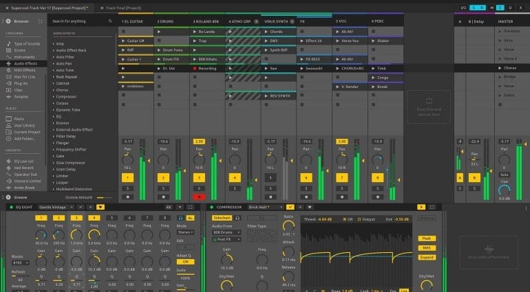
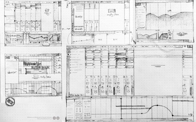
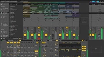
With Ableton Live 10 in the making, you might be wondering if EDM producers’ go-to DAW is due for a fresh coat of paint. GUI changes are always typical of big version upgrades. Of course, only the gang at Ableton and a handful of testers knows whether the software is getting a new look. Though designer Nenad Milosevic’s imagination ran rampant enough for him to put together an impressive, highly authentic concept of what Ableton 10 could look like.
What you are seeing doesn’t look super different, but it’s thought out enough to look new and fresher without straying from the design principles and elements you are accustomed to. In this concept, Live is still the flattest-looking, and possibly darkest DAW around by virtue of its spotless vector interface. It has to be said that Ableton’s design restraint is commendable and influential – it makes sense that Nenad chose to honor it, rather than go crazy with Photoshop.
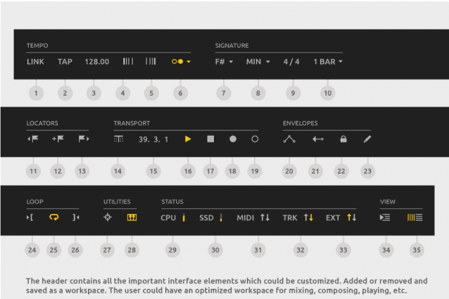
What’s more, the interface is optimized to fit more information on a single screen and has become more elegant with new header buttons that would look awesome on a touch-screen. These tweaks are inspired by Live user feedback, hence this is stuff people would actually like to see in Ableton. Nenad has provided a great illustration of “the people’s Ableton” – which is, again, not all that different from the one made in Berlin.
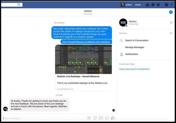
Like what you see or not, Ableton is aware of Nenad’s work and the user feedback behind it. It’s good to know that the company is open to receiving fresh ideas from the community. Some parts of this design could realistically end up in the next version of Live, either because Ableton liked it or they were themselves working on similar concepts. We’ll have to wait a while until we get to know more. Tell us what you think about Nenad’s work in the comments below, or vent your frustration with something particular that you don’t like.
[interaction id=”5948dd4191c674963889f460″]
