Skinning Sonar with Cakewalk’s Theme Editor
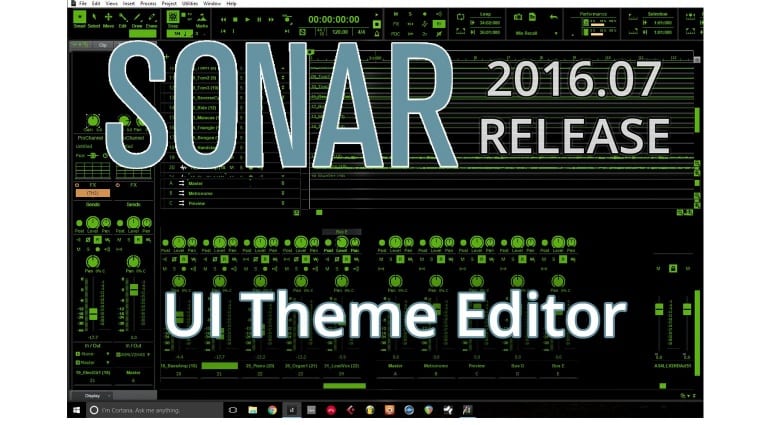
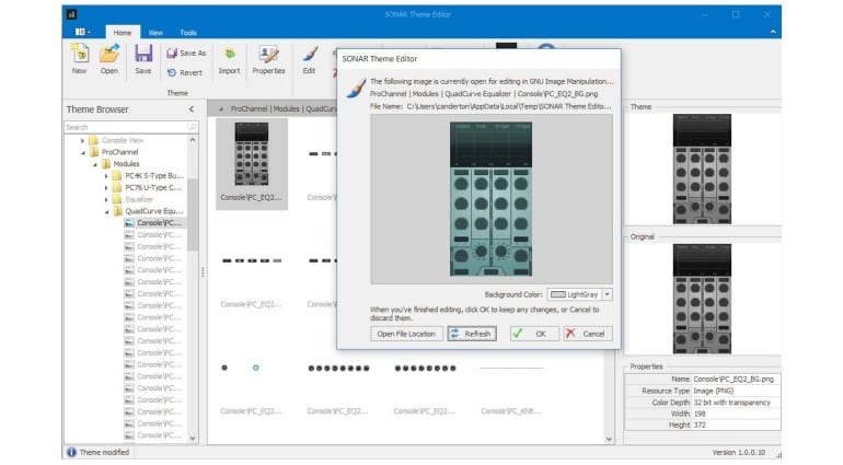
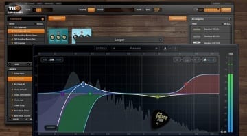
Just when we’re completely at home with Sonar and its monthly updates it goes and does something bonkers. The big feature of July’s rolling update is the Sonar Theme Editor where you can now take the GUI apart and put it back together however you like.
They’re calling it “unprecedented” and it’s a very apt term. I’ve never liked the Sonar interface. It’s never gelled for me. It’s been a mis-match of colours, confusing content and a console that’s just never hit the mark. Maybe they’ve decided to stop fiddling with it and give the community a chance to breathe in some new life. Well whatever it is they’ve certainly embraced it with full force. I mean look at that screen shot, it’s as crazy and it is awesome!
I am greatly reminded of those long gone days when Propellerhead Rebirth RB-338 was all the rage and the interface was fully modable. It threw up some terrible and some amazing colour schemes. But this sort of power given to your user community can product some interesting results. I truly hope that the Theme Editor will allow for theme sharing.
The Theme Editor is only available with Sonar Platinum and has to be installed via the Command Center.
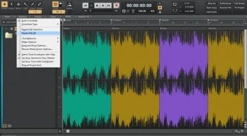
Other updates this month include enhancements to the Smart Swipe feature introduced last month. You can now cancel a swipe by going in the opposite direction and more controls now support it. The LP MB and EQ mastering plug-ins have been updated to include side-chaining, better phase accuracy and GUI enhancements.
I can’t wait to see whether new themes will start sticking to Sonar. This could really be transformational – good show Cakewalk.
More information on all the updates and fixes is available on the Cakewalk website here.

